Festival branding for not for profit
Japan Festival
A simple brand identity for a biennial festival focused on strengthening connections between Japan and New Zealand through food, performance, and shared cultural experiences.
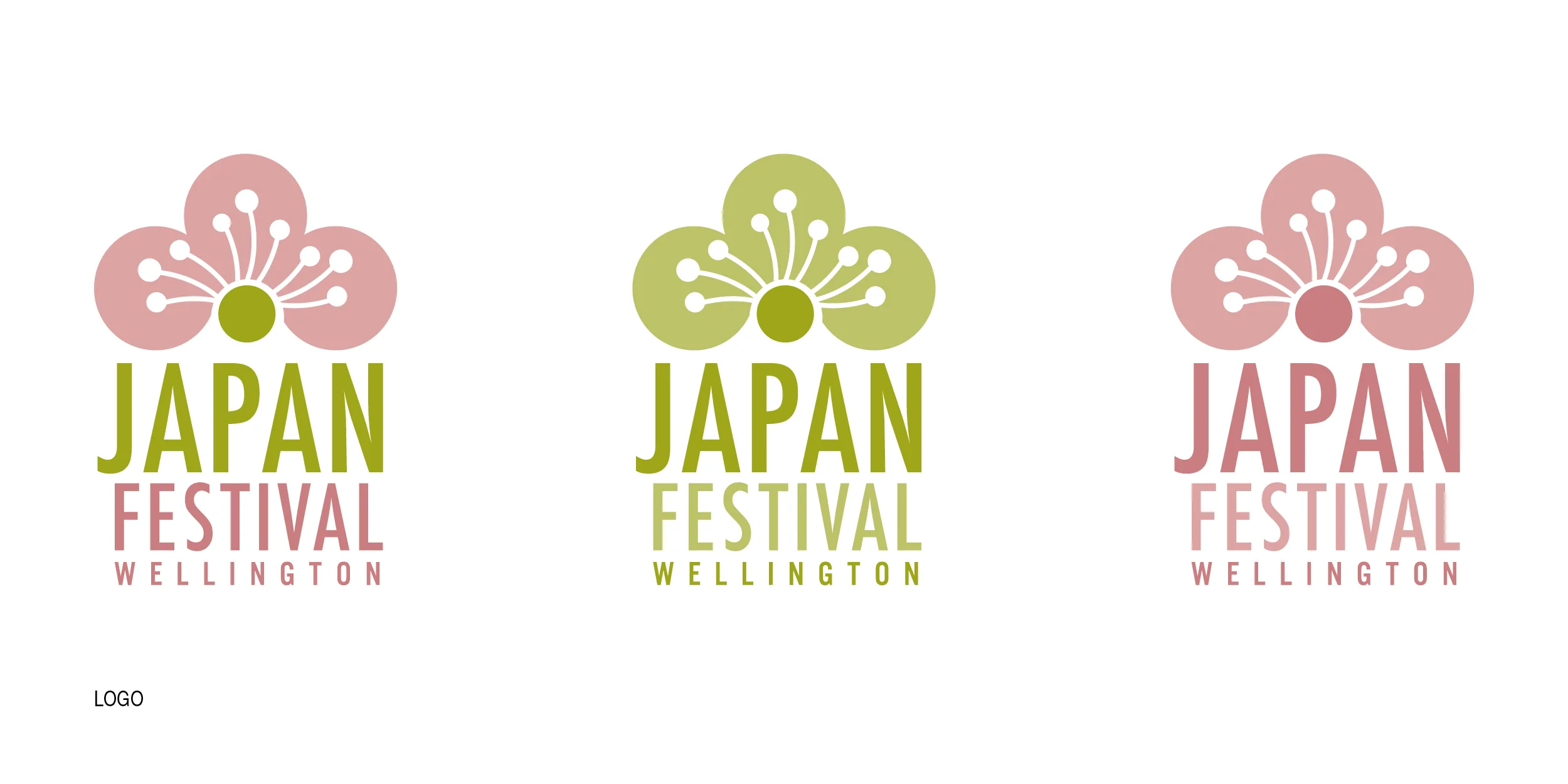
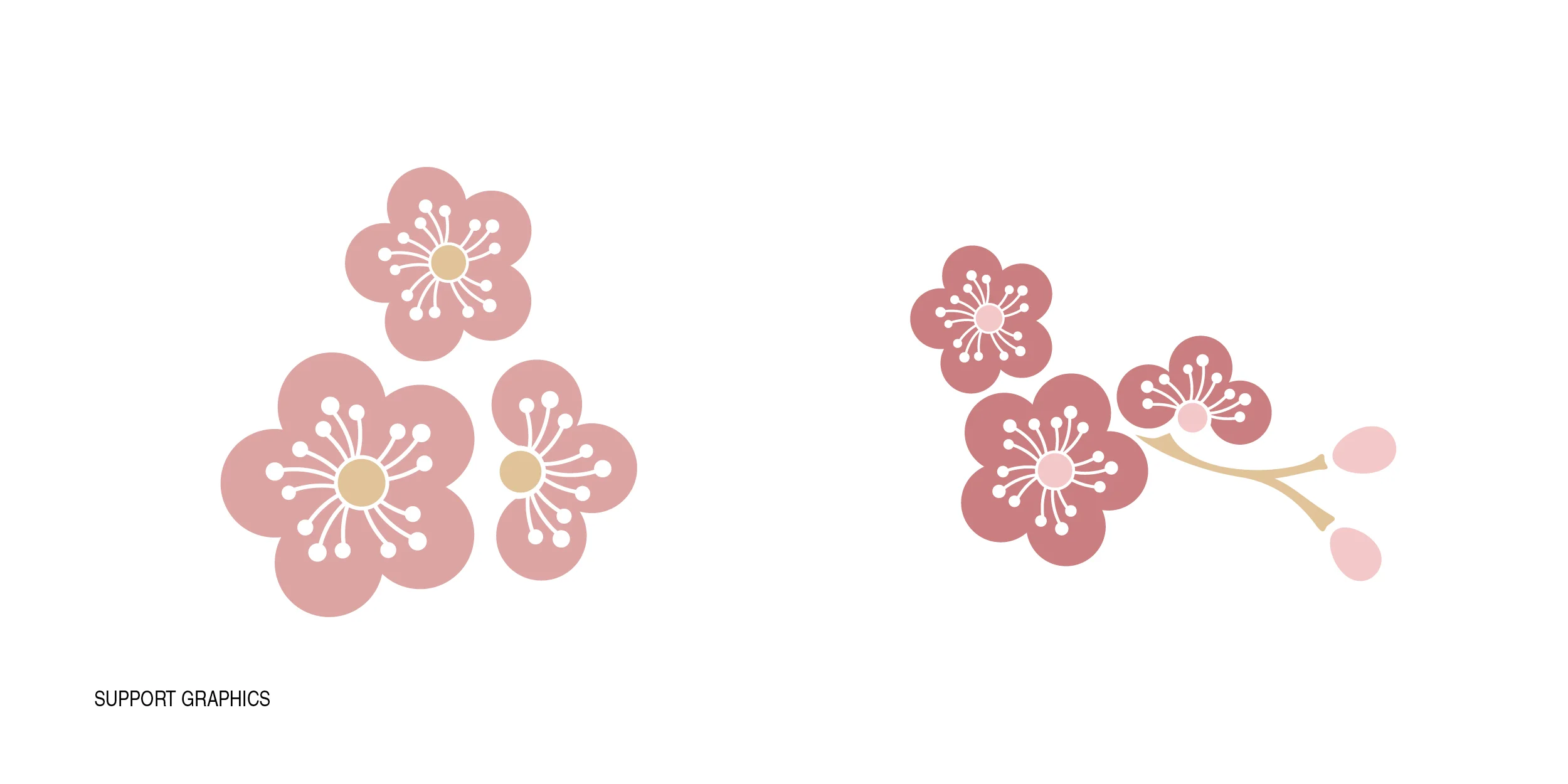
Developed while working alongside the Asia New Zealand Foundation, this was a small not-for-profit project aimed at giving the festival a cohesive set of visual assets it could use across channels at minimal cost. The cherry blossom was chosen as the central motif, not just for its recognisability, also for its association with seasonality, gathering, and reflection, which aligned naturally with the spirit of the event.
A soft palette of cherry blossom pink and wasabi green were used to support this, creating a look that felt fresh, welcoming, and accessible without overcomplicating the identity.
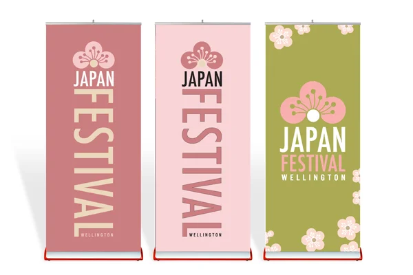
This one was done a fair while ago, but I see the branding is still in use.
Sometimes simplicity and ease of asset use make brands and assets stand the test of time.
https://www.japanfestivalwellington.org/
Festival branding and event promotion
Lantern Festival
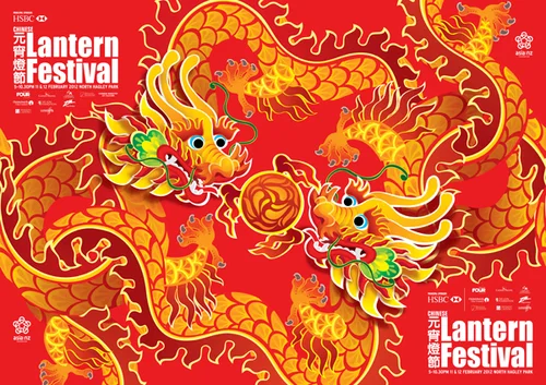
The Lantern Festival is a vibrant festival hosted by the Asia New Zealand Foundation in Christchurch, Wellington and Auckland for many years. The bring out silk lanterns each year for an extravaganza to celebrate the Chinese New Year.
For this year we featured two dragons playing with a fire ball… a well recognised subject.
Collaborators: Caspian Ievers Creative Director, Strategy Design & Advertising, Watermark Creative for the Illustration of the dragons!.

This was a really effective poster design because it could be tiled infinitely along fences and advertising hoardings. It was a technique the agency I worked for at the time had successfully used across a number of different designs to create a dramatic takeover of outdoor space — creating memorable customer moments.
Festival branding and event promotion
Diwali Festival
I’ve worked on this festival across several years and at two different design agencies, collaborating with a range of creative teams and working closely with Asia New Zealand Foundation. Each year brought an opportunity to find a fresh creative lens for the festival to connect with New Zealanders and to highlight a different aspect of the Asia NZ Foundation’s purpose and story.
We:
Crafted a minimal cost effective brand identity for the event including print and digital ads
Branded the doors of the TSB Event Centre with a vinyl wrap to draw the public in from the waterfront.
Branded the key stage areas in Wellington and Auckland.
Branded a tent experience for the Auckland festival.
Created an interactive cube display and poster campaign for in-venue to educate festival goers about the work the Asia New Zealand Foundation do.
My Role:
Account Director
art direction and collaborating with the design team and client to concept the best bang for buck, and visitor experience in our venues both outside and in.
management of designers and production and crafting the advertising and exhibition space collateral.
sourcing merchandise, and branding t-shirts for the crew
assisting client in installation of poster campaign and interactive boxes in venue.
Team —
Salted Herring Brand and Digital
Di Fuller at 2Di4 Design for brand Strategy
Lindy and Mike at Dusty & Lulu for Design of our assets
And a shout out to our printers and suppliers for merch, and assets:
- Baseline in Petone for printing of posters and interactive boxes and competition assets.
- Brazen (love these guys have used them many times for t-shirt printing) .
Client: Asia New Zealand Foundation, John Saunders.
Diwali Festival Wellington & Auckland.

This year we decided to do a takeover on the glass doors to the TSB Arena. This is a method several people do when they have events here and it’s so effective as it showcases whats on to all the walk traffic over the week prior and is such a lovely welcome for event goers on the day - setting the scene!

The core idea was around a bold DOT graphic device. The DOT gave us a simple and consistent visual thread across the festival’s many touch-points, providing a frame for photography, quotes, facts and storytelling while allowing the content itself to change and evolve.
We extended the DOT language into the physical festival environment through a series of oversized cubes featuring photography, quotes and facts. These explored both the Diwali celebration itself and the broader relationships Asia New Zealand Foundation builds across the Asian region, creating moments for festival-goers to stop, engage and discover more.
The dot visual device translated particularly well to staff T-shirts, giving the team a distinctive and cohesive presence throughout the event.
Website refresh for new festival season | Art Direction and Project Management
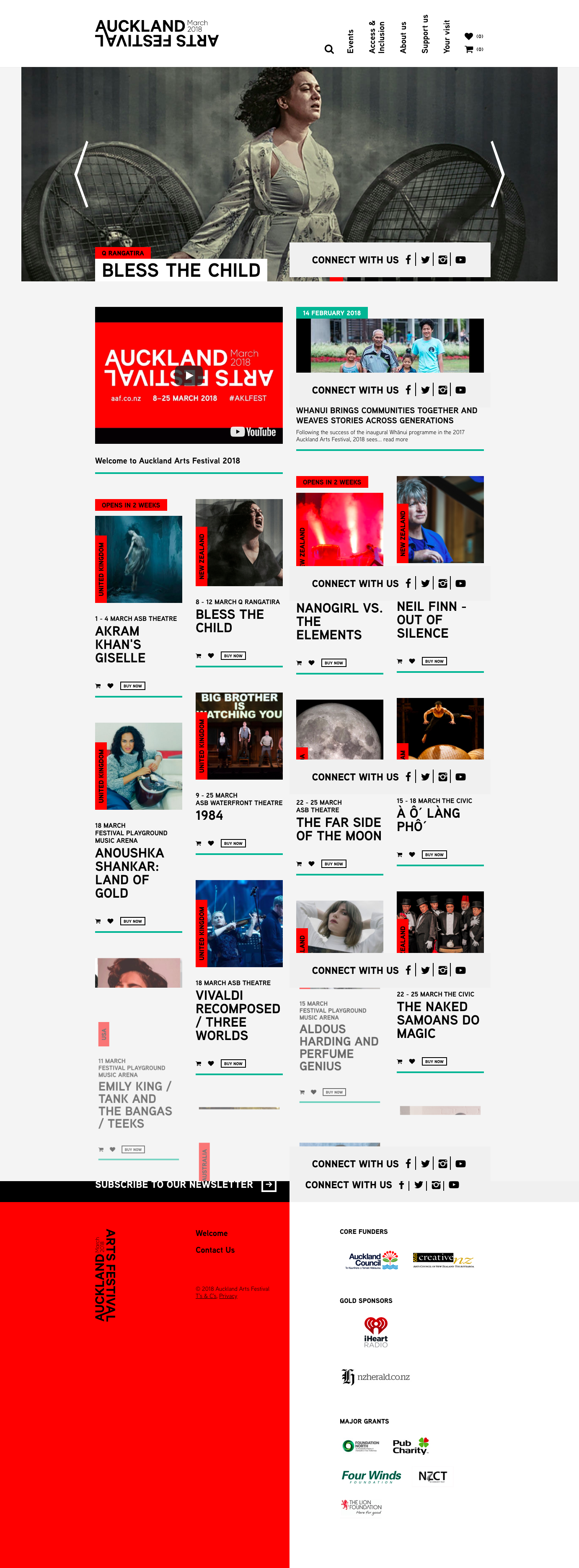
Auckland Arts Festival
I led the agency relationship and delivery of a website refresh for Auckland Arts Festival for one season, working across the client, design and development teams to create a fresh digital experience for a new festival year without the cost of rebuilding the underlying technology.
The brief was to make the site feel new and distinctive for the upcoming festival while reusing as much of the existing platform as possible.
I led the project scoping, identifying which templates, content modules, tiles and UI elements could be retained, refreshed or adapted, and worked closely with the designer and developers to shape the approach we’d take to keep the project commercially viable.
Guiding the project through to launch, managing our stakeholders, priorities and delivery across the agency and Auckland Arts Festival teams was made so much easier by the team at AAF who were really collaborative.
I also worked closely with AAF to support CMS training and helping them hands-on updating content for the new festival programme, providing ongoing troubleshooting and also post-launch support via our development team.
It’s really satisfying updating a theme, and adding a few enhancements to a website such as this, seeing how different things can look with reasonable but not huge visual and interaction updates. This is a technique I’ve used many times and likely will again!
Collaborators: Pep Zuijderwijk, Creative Director Salted Herring, The Development team at Salted Herring, and Auckland Arts Festival team.