What is a design system?
Design system vs Pattern library vs Style guide, these terms are often confused, here’s the distinction.
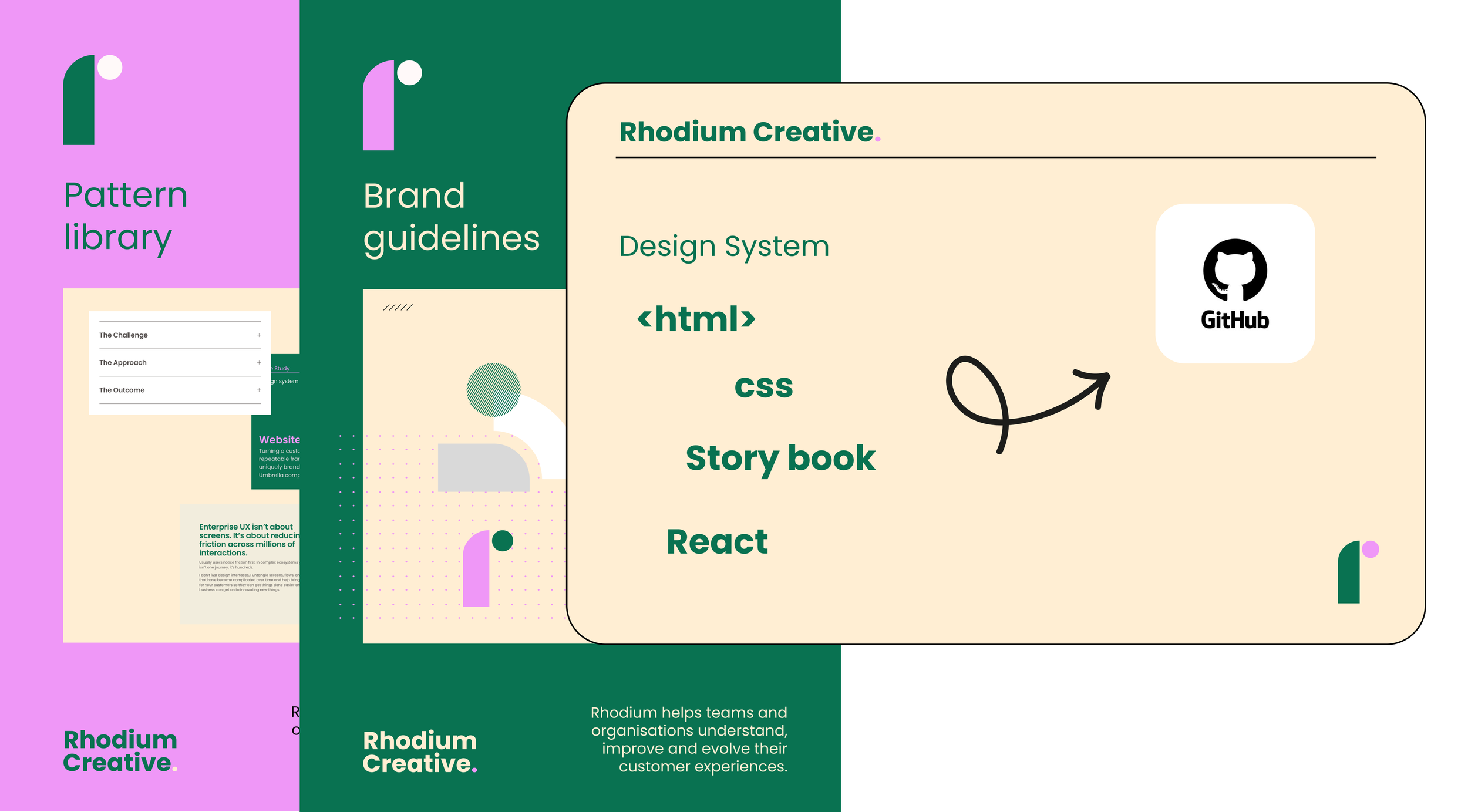
A Design system is
the full stack. Principles, design tokens, components, patterns, code, accessibility rules, governance, and a contribution model.
A design system observes a style guide (brand guidelines) but also includes components, reusable code, pattern libraries and additional rules.
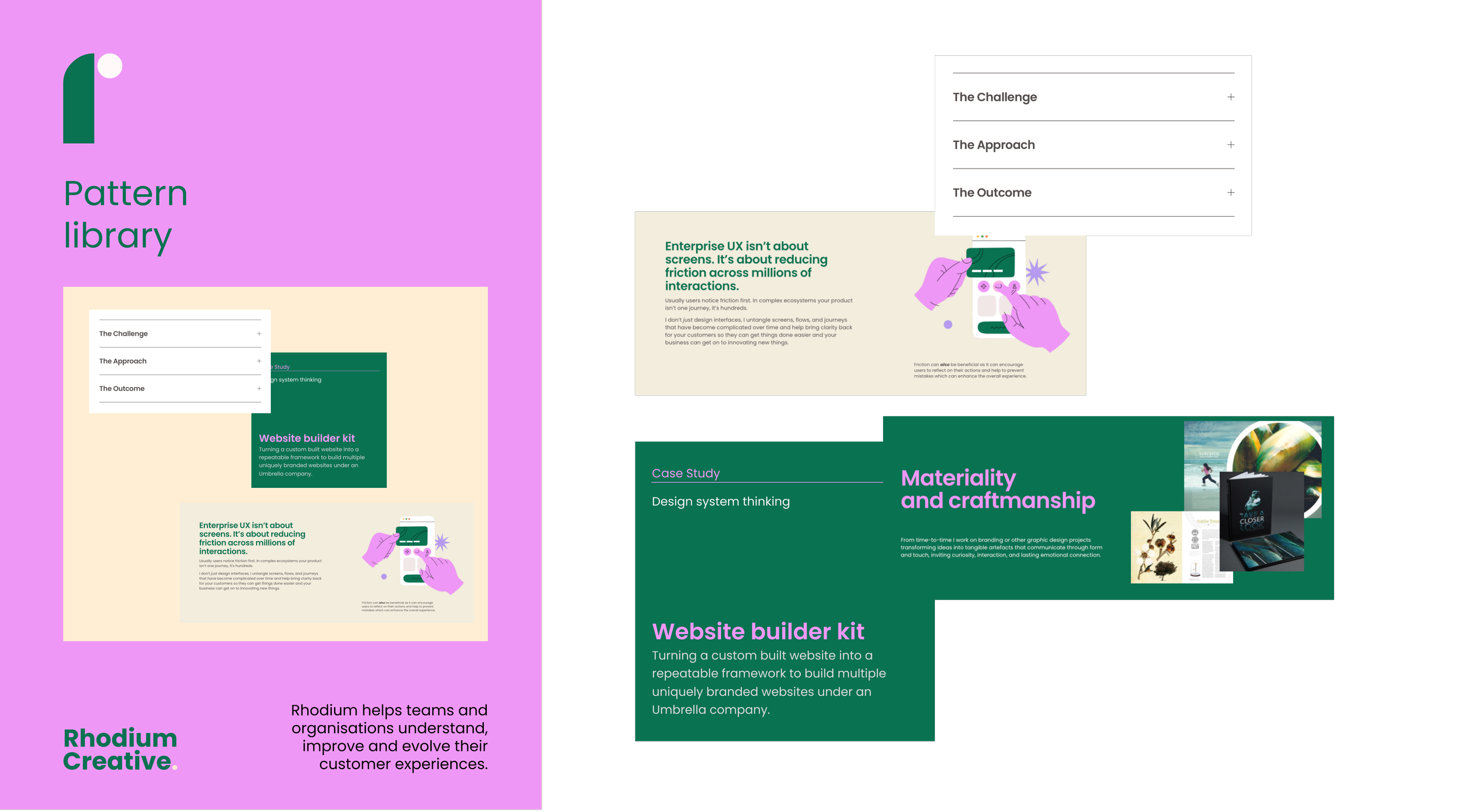
A Pattern library is
a collection of reusable UI patterns such as form layouts, navigation structures, card patterns along with usage guidance.
A pattern library is typically part of a design system, not a substitute for one.
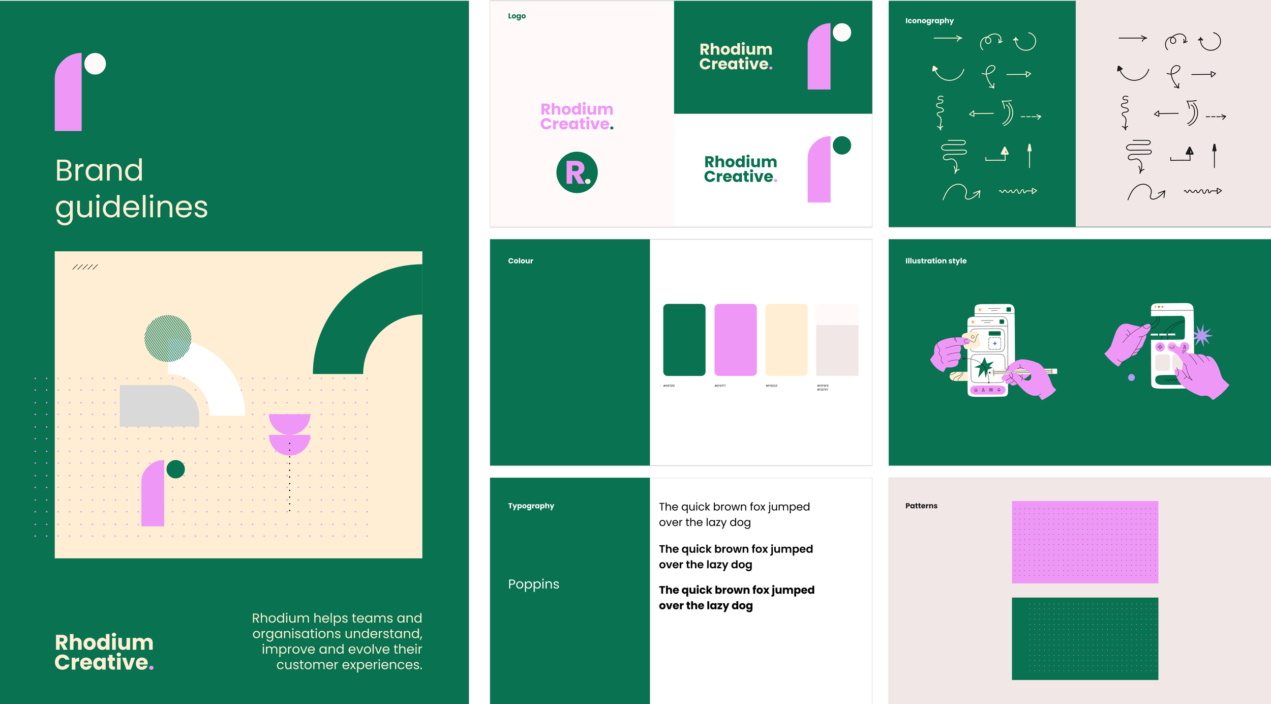
A Style guide is
brand and visual language documentation. Typically logo usage, colour definitions, typography, and tone of voice.
A style guide supports a design system but typically doesn’t cover components or code.
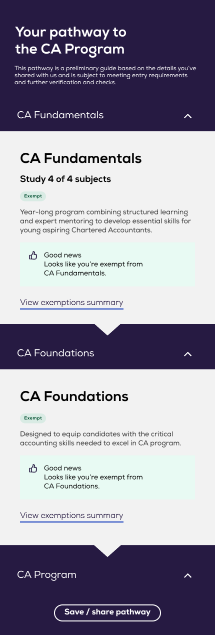
Don’t have a design system yet and not sure of the benefits? Read a run down on the value a design-system can bring to all in the product team.
4 ways to apply design-system ‘thinking’
Case Study one
Theme upgrade for Ed Tech SaaS product
When you don’t have a fully fledged design system and you’re building and them-ing new experiences for the one organisation what can you do?
-
Applying your brands core colours and font to a ‘theme area’ of a product seems easy right? But think about the work a designer and team did when designing that SaaS product ORIGINALLY. They tested and tried many iterations before they got ‘their’ theme and components working.
Questions they asked:
What’s the dark colour or primary colour in the brand? Where should we apply it.
Does it work with text over it.
Does the navigation work, what about roll overs. How do buttons, accordions and interactions work, what’s the primary, secondary options.
You can see the challenge here, simply applying your brand colour to a ‘theme’ area and loading up your font is NOT the right approach to give the optimal experience to your users. You might fluke it but chances are you’ll pretty soon find some areas of the product experience that aren’t working well.
We needed to audit and review the components
Style over top of all components and then due to custom pages and code having been added to some flows test all reports/flows and screens to catch all the outliers that weren’t captured in the component kit.
-
Tackling the component layer AND also analysing UX flows.
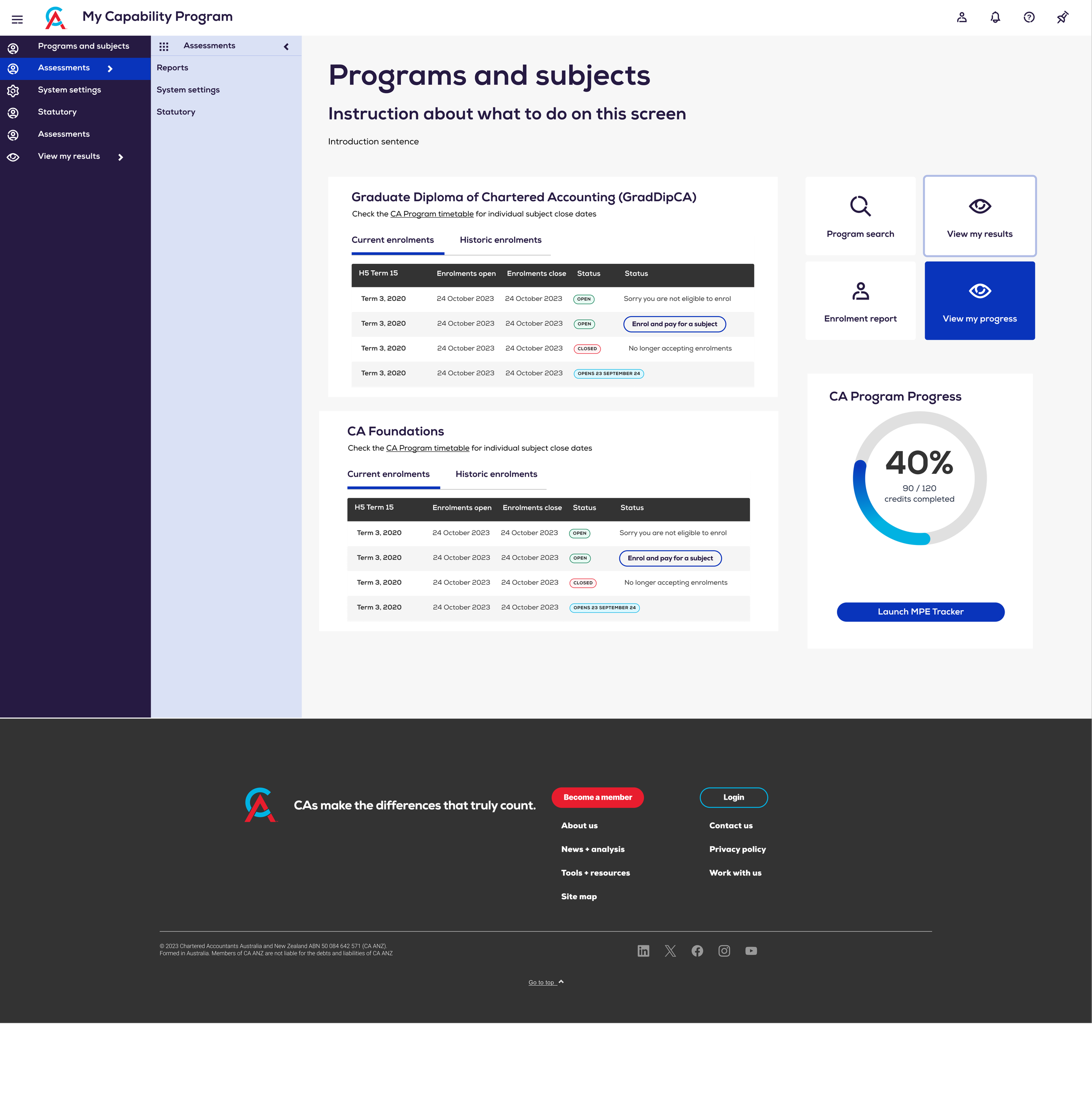
Established a clearer visual identity and branded layer across the portal
Introduced persistent side drawer navigation to support orientation
Applied a more considered, accessible colour system
Strengthened typography contrast and hierarchy
Introduced dynamic UI treatments (e.g. gradients, progress indicators) to communicate movement
Implemented custom brand iconography
Addressed usability issues alongside visual improvements (not treated separately)
Created task-specific flags and status indicators to improve clarity and flow
-
A clearer, more recognisable product experience
Users move through tasks with more confidence and less friction
Improved readability and accessibility across the platform
Stronger engagement through clear feedback and visible progress
A consistent, scalable UI that’s easier to maintain and build on
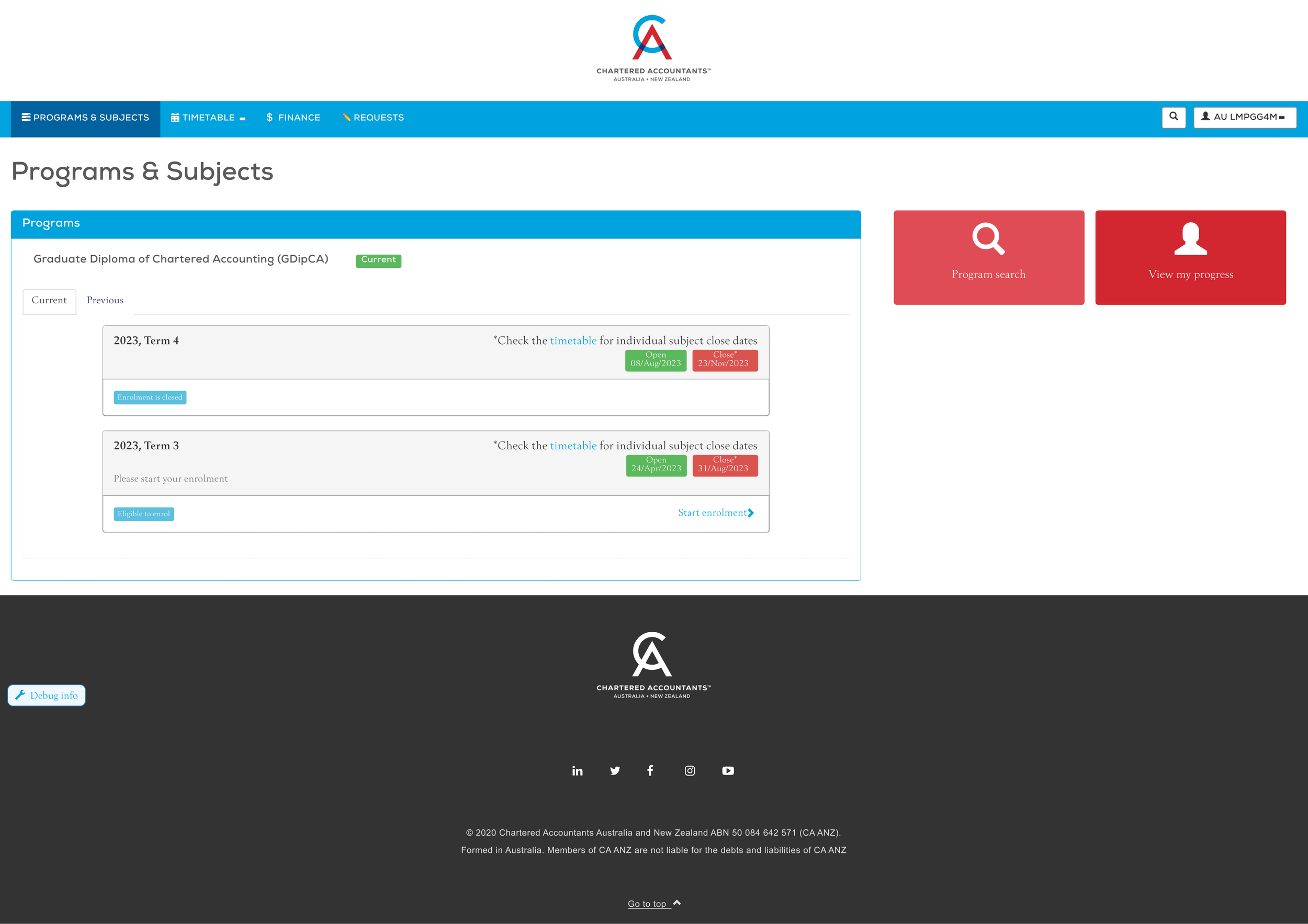

Custom widgets for use in Learning Management System
Case Study Two
-
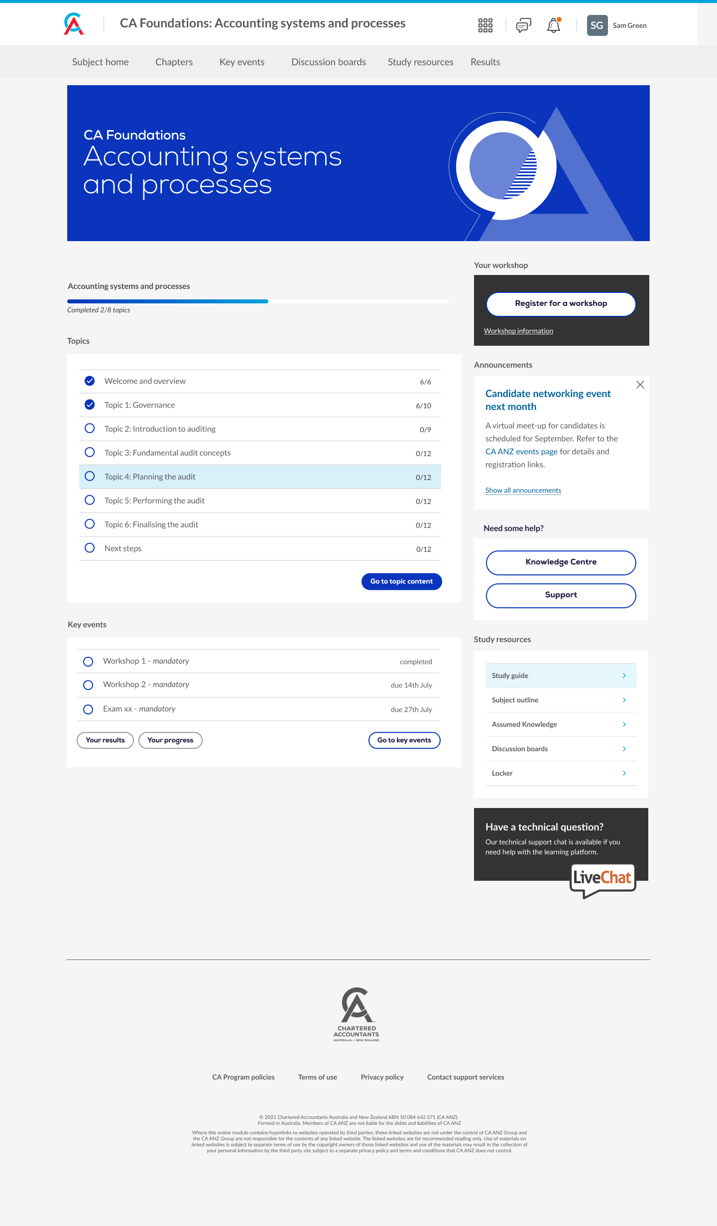
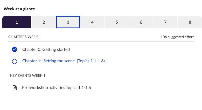
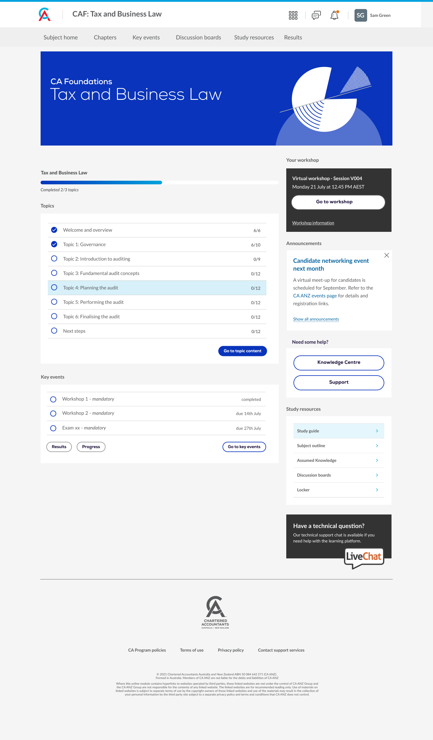
Home pages needed to do more than just introduce a subject/course, they had to clearly guide learners on what was inside, what mattered, and where to start.
Out of the box, this wasn’t happening.
With multiple subjects, deep content structures, and different authors building pages in different ways, there was no clear front door into the learning experience.
Home pages needed to act as a simple, reliable guide: setting expectations, surfacing key content, and giving learners a clear path into their study.
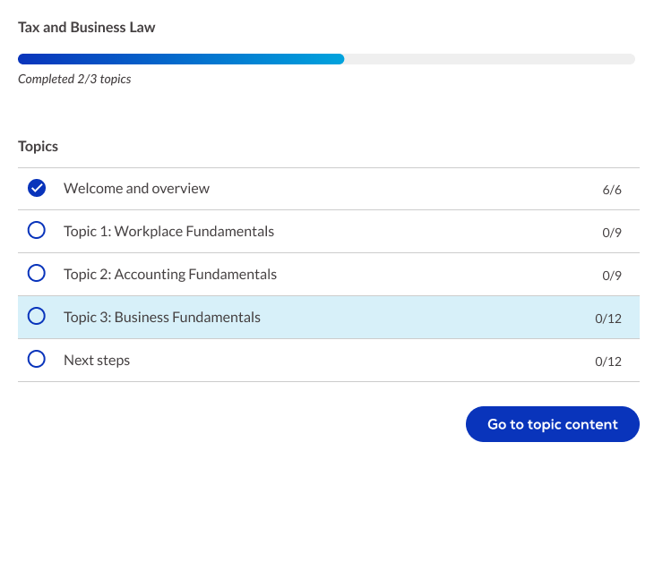
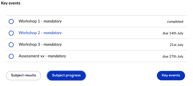
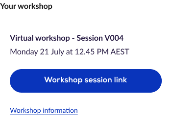
Sidebar widgets needed to play a clear role to surface repeat activities so learners didn’t have to hunt for them every time.
-
Designed a consistent visual and interaction system across all learning pages
Introduced modern UI patterns, hierarchy, and interactive elements
Applied a lightweight CSS layer to enhance Brightspace without heavy customisation
Built reusable templates and components for course authors
Designed navigation, wayfinding, and progress indicators
Applied accessible typography, spacing, and colour systems
Embedded brand into the learning experience
Set up a single source of truth for ongoing design governance
-
Learners move through content with confidence and less friction
Higher momentum through clear progress cues and feedback
Strong and consistent brand presence across the platform
Faster course creation with less rework and better consistency
A more polished, premium experience beyond the default Brightspace interface
Scalable consistency across courses without reinventing patterns

Case Study three
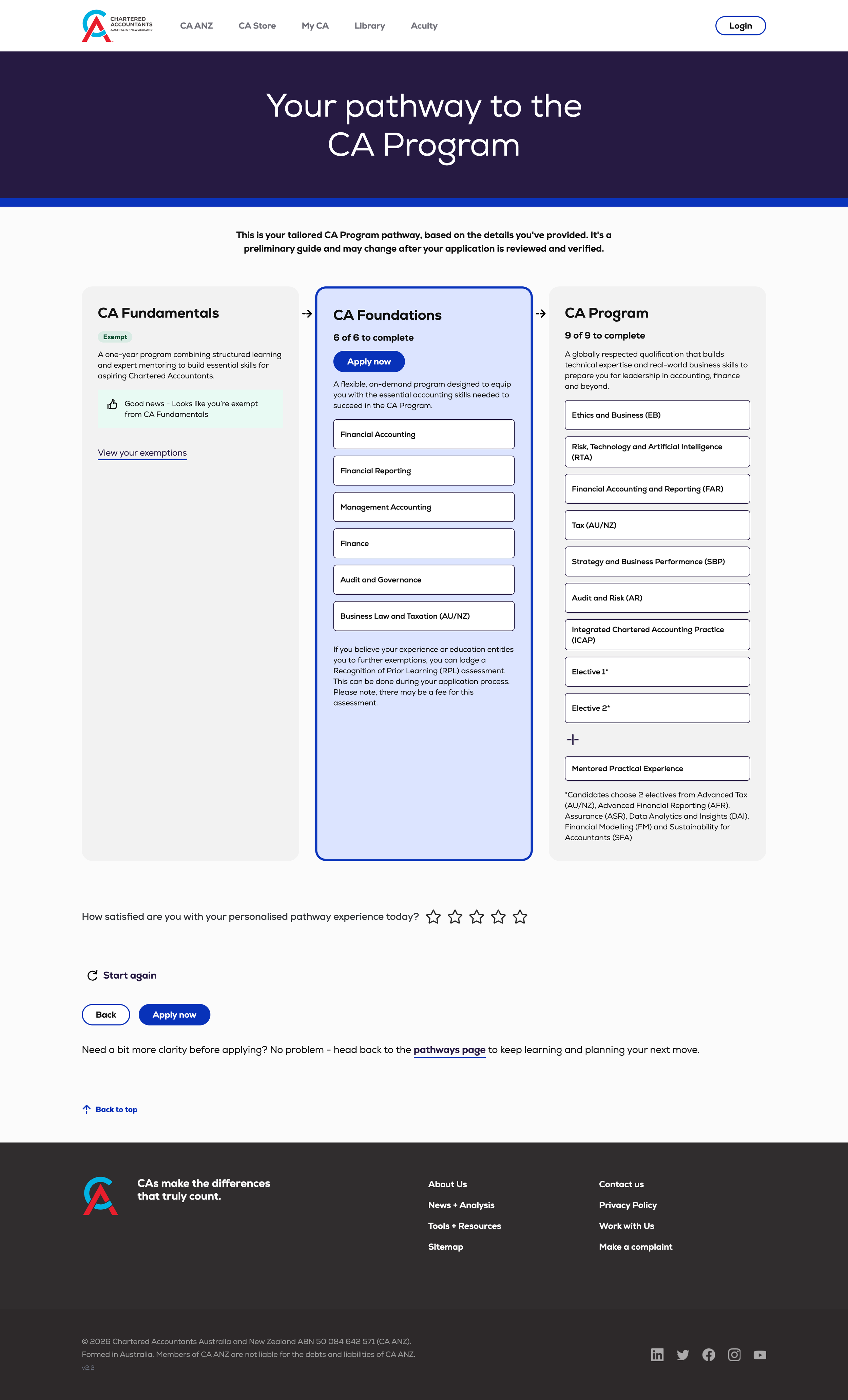
New product design
When you have built products over time and need to add new into a legacy system a brand and component audit is the best first step. Then only add new where new is needed.
-
A new product design to fit within a companies eco-system.
The website and other predominantly SaaS products all looked different.
The brand had recently undergone a refresh which had tackled marketing activities but not digital products.
The website was about to undergo a rebuild/refresh but nothing was available at time of this product build.
The product itself had a number of challenging activities requiring knowledge upfront/ or for customers to get documentation ready
The product experience required customers to traverse through a number of external portals/for account set up and ID verification external to this product experience.
-
Designed a consistent visual and interaction system
Designed form layouts to work on mobile and desktop with complex text and long form copy
Designed navigation, wayfinding, and progress indicators
Embedded a brand that had only just been style guided and not used in practice on a digital product yet into the experience
-

Check out this product in action
Case Study four
Illustration systems
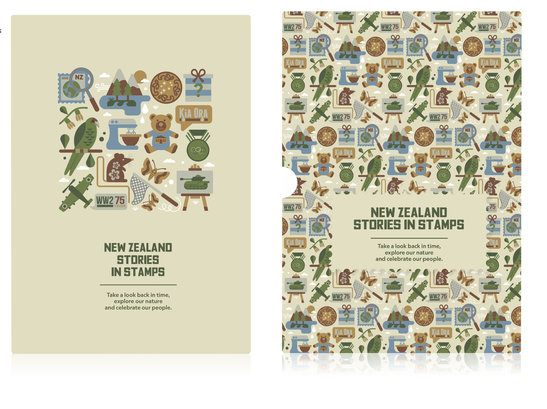
Illustration systems can be a powerful way to guide people through a digital experience but can work well in the physical world.
In this example, illustration and icon systems are layered throughout a physical publication to provide a consistent visual language and wayfinding framework. They help create cohesion across diverse topics, reduce feelings of overwhelm, and provide readers with a clearer pathway into the content.
IMAGE 1 ABOVE LEFT: Book cover when pulled from the sleeve focusses in more clearly on the refined system of 12 stories customer will find inside.
ABOVE RIGHT: Outer box shows full illustration system in pattern form.
-
THE OPPORTUNITY
The annual stamp publication for New Zealand Post is a collection that showcases a new stamp edition released each month gathered in a yearly collection.
THE CHALLENGE
Each stamp issue is very bespoke, and not related to any other issue so how do we create an engaging coffee table experience for a reader that makes sense as a collection?
-
Layer the story-telling, and hint at what might be within the collection on the box in an engaging way that would look good on retail shelves.
Group and theme sections/or chapters, groups of stamps together to make a reading experience that was easier to dive into.
Leverage experts to bring MORE to the project. For this project, I collaborated with one of my favourite New Zealand illustrators, Greg Straight. Each stamp edition is accompanied by a story that expands on the theme behind the stamps, revealing layers of meaning that go far beyond their small format. After reading each story, I developed a series of storyboard concepts to capture their essence, working closely with Greg to refine these into a cohesive set of icons — one to introduce each story. Then grouped three sets of stories into chapters, around a theme, history, people and nature.
The full illustration system was then brought together on the cover, offering a visual window into the content within.
-
A layered, interconnected set of visuals that reflect the richness and depth of the stories inside.
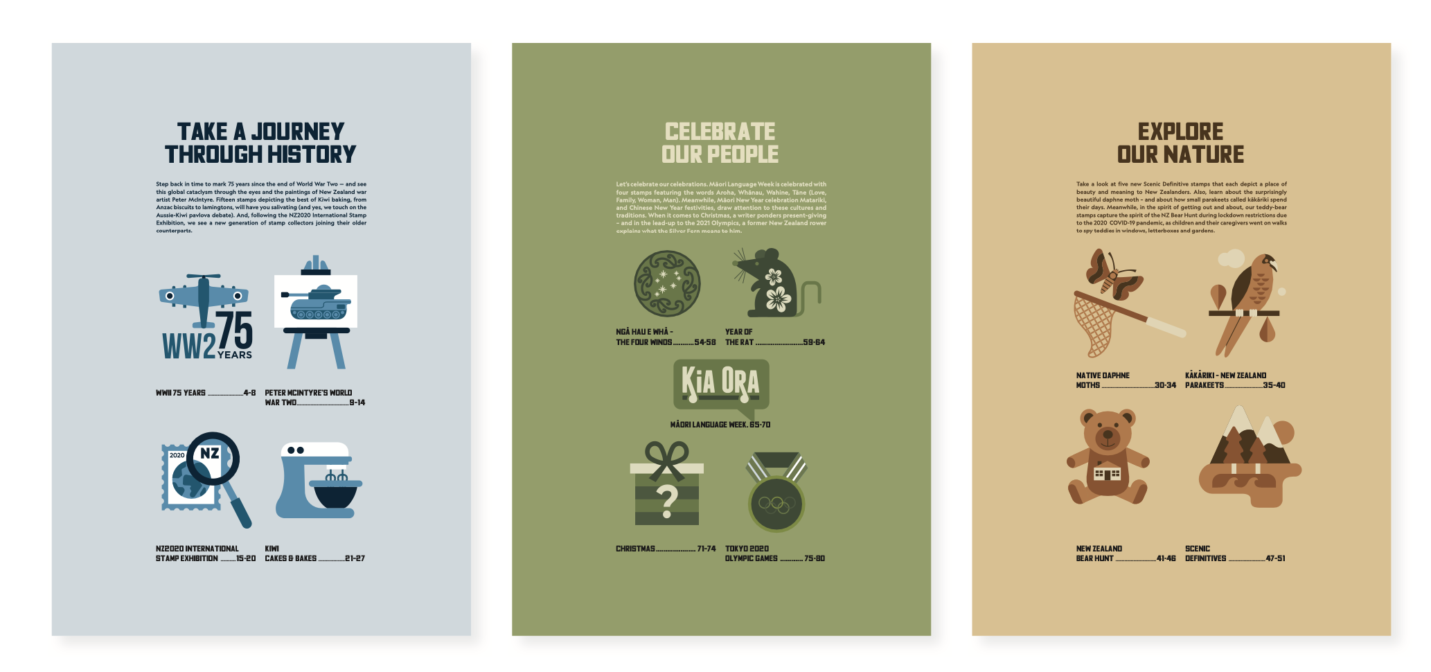
IMAGE 2 ABOVE: Section breaks within the book feature the stories within.
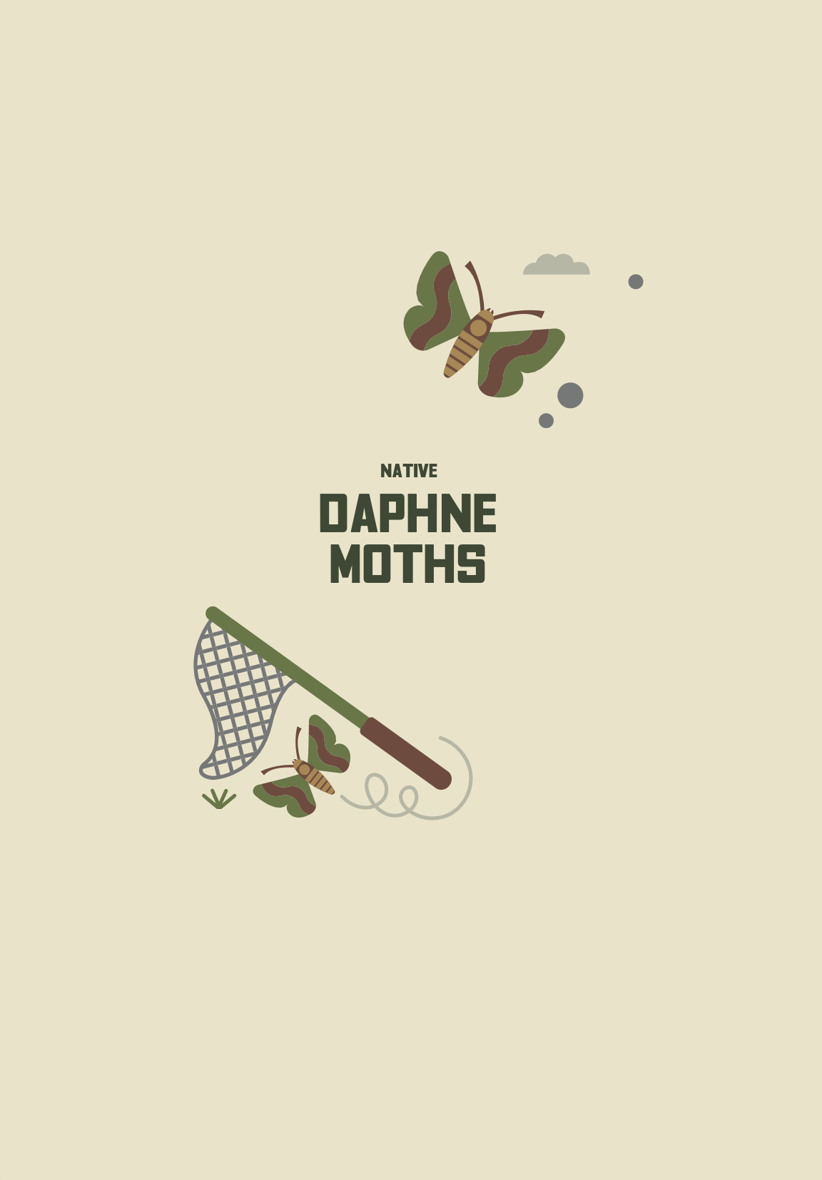
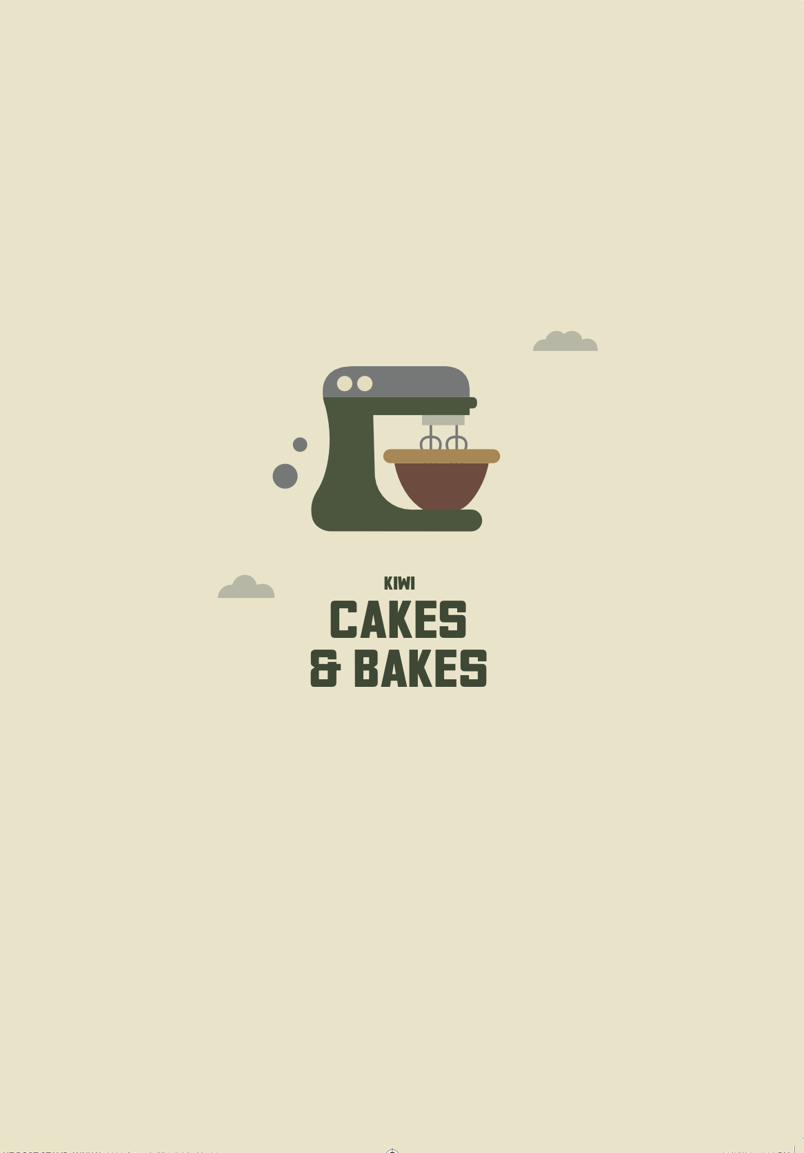
IMAGE 3: Title pages of singlar stories at a third layer of depth feature an illustration that speaks to what the story is about.